One of the first things you want to decide when wedding planning will be your wedding color palette. These are the colors you’ll use throughout the day. From the ceremony space to the reception venue, the invitations, and the centerpieces, your whole wedding will be filled with colors. You want to make sure your colors not only go together but also photograph well. Here are some ideas you may want to consider when selecting your color scheme.

What’s your favorite color?!
Okay, I know I sound like Buddy the Elf, but what’s your favorite color? What color makes you happy merely by seeing it? I love green! While you might not want to paint your bedroom that color, you should consider adding your favorite color to your wedding color scheme. Typically, your favorite color brings you joy, and it also represents you. Ensuring your wedding day reflects who you are as a couple and as individuals is essential, and using favorite colors can help.
Consider Your Venue
If you’ve already booked your venue, be sure that your color scheme will work well within the space, specifically if it has non-neutral colored walls or carpet. For example, many hotel ballrooms have heavily patterned carpets that you want to be mindful of when selecting your colors.
Also, historic mansions typically have ornate wallpaper or deep, rich-colored hues throughout the space, so find a way to incorporate those colors into your wedding day vibe! If you are still looking for a venue, keep in mind the colors you aim for and envision them in the space.


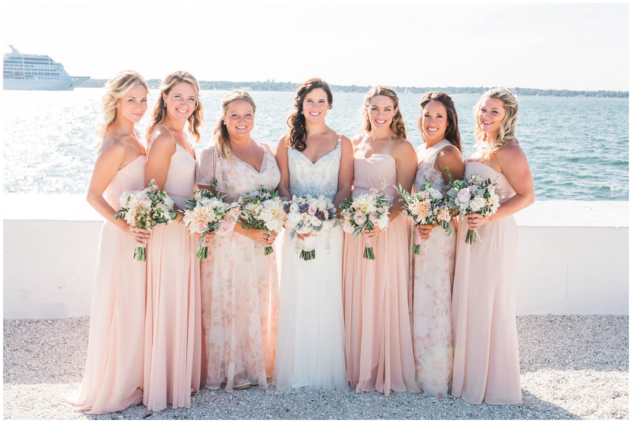
Primary Colors & Accent Colors
Keep your color scheme to 1 or 2 primary colors to enhance the overall day and make your images stand out. If you plan on using bright, bold primary colors, try to use one color more than the other.
Next, use neutral colors to balance everything out. Neutrals can range from taupe to beige to gold to silver and can even include greenery. Bold and bright colors look chic and sophisticated and capture attention in images, but they need to be balanced.
Consider Textures
Two colors may look stunning together when paired on flat surfaces, but what if one color is textured?! *Mic drop!* Texture can add even more dimension to your palette. You may want to change up your colors slightly if you are going with a colored table runner, lace gown, or have a lot of rustic touches (wooden farm tables or stone floors). Textures can help subdue overly bold colors and can also change the mood of the space.
Set the Mood
Speaking of mood, you want to understand how your color scheme can affect your wedding’s tone and mood. Pastels tend to give off a more whimsical and romantic feel. Deep gem-tone colors can feel rich and formal. Bold colors may feel playful and tropical. Be sure your color scheme will help enhance the mood you are trying to set so that it comes across in your décor and in your wedding day photos.
Leave a Reply